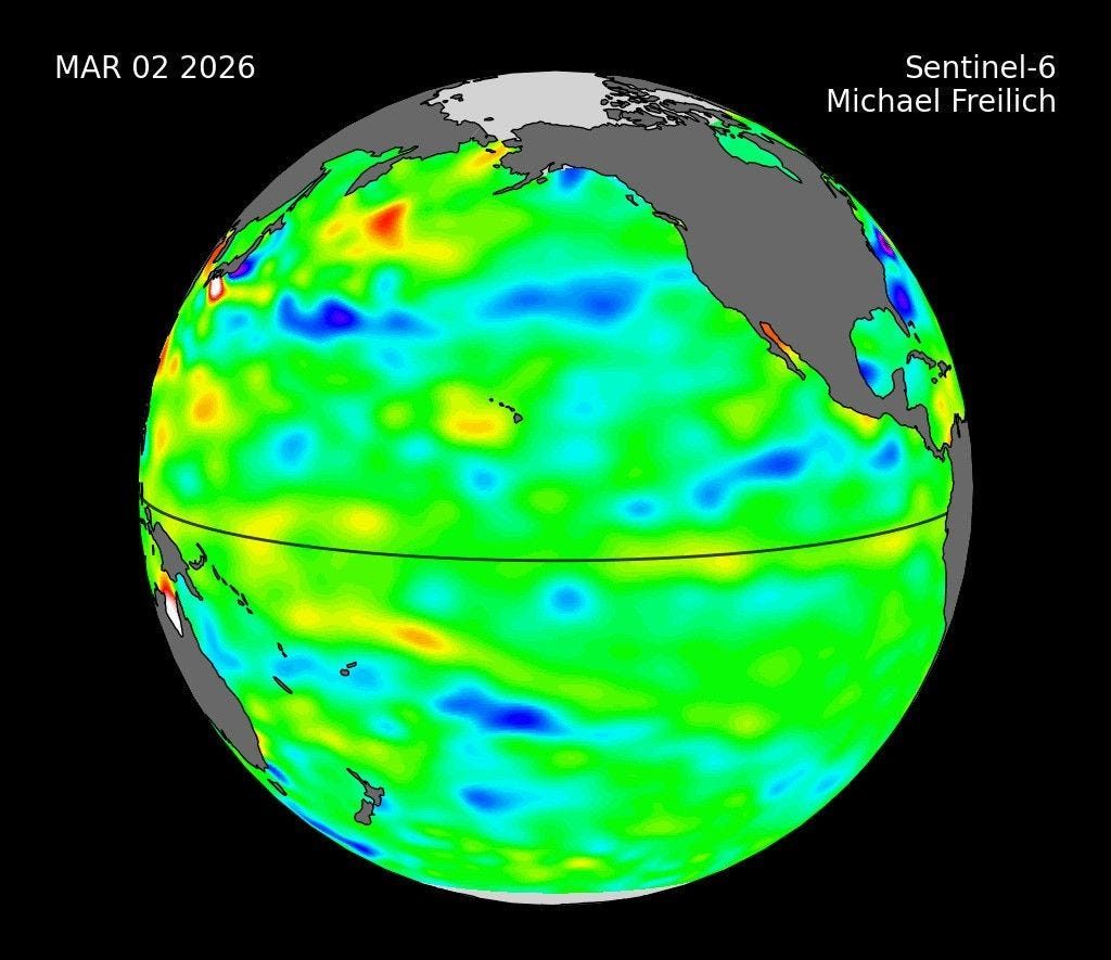
What you are looking at is not a model output but a measurement.
Water expands as it warms, so a satellite that reads sea-surface height to within centimetres is also, indirectly, a thermometer for the upper ocean. Between March and May, JPL tracked a slug of warm water hundreds of kilometres wide, a Kelvin wave, sliding east along the equator until water off Colombia, Ecuador and Peru stood more than 15 centimetres above the long-term average.
The analytical significance is timing.
A Kelvin wave is a precursor, not a symptom: it travels the basin in roughly two months and delivers heat to the eastern Pacific before the atmosphere has responded at all.
That is why NASA’s sea level portal could flag the event in early June while surface indices were still ambiguous — and why forecasters had unusual confidence months ahead.
There is a comforting story going around right now: 2026 was brutal, and it is nearly over.
Four more months and we reset. The tropical Pacific has not read that story.
On 13 August, NOAA’s Climate Prediction Centre put a greater than 90% probability on a very strong event, and a 69% probability that it exceeds +2.5 °C in October–December beyond anything documented since records began in 1950.
The CPC’s full technical briefing, updated 17 August 2026, carries the subsurface and heat-content diagnostics behind that call.
Then, on Friday 21 August — as this was being written — the UK Met Office went further than any major agency has gone on this event.
“We should be clear that this is an unprecedented event. I have never seen an El Niño signal this intense in our forecasts.”— Professor Adam Scaife, Head of Long Range Forecasting, UK Met Office official statement, 21 August 2026
Scaife told the BBC that a 3 °C rise in the Niño 3.4 region would be “unheard-of in modern climate records.” For scale: a typical El Niño lifts that region 1–2 °C, and the Met Office describes 2 °C as “really big.”
This event peaks in November and December. Its consequences — failed harvests, price pass-through, humanitarian appeals, fiscal holes — arrive in 2027. 2026 was not the disaster year. It was the year the disaster occurred.
Part One- Watching it form
By early June, the warm water had arrived and spread. NASA’s Earth Observatory published the image below on 8 June; NOAA formally declared El Niño three days later.
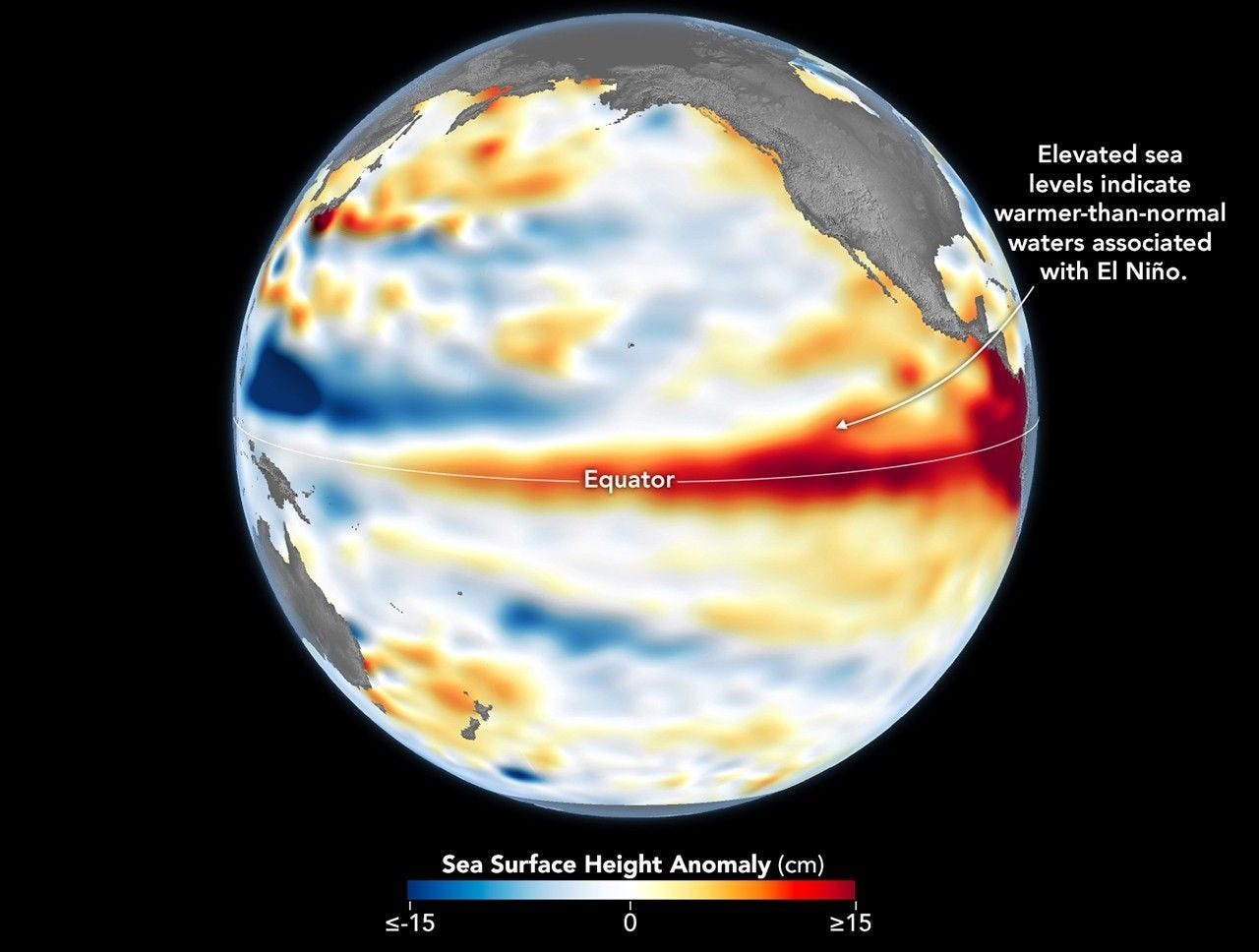
What changed between Figure 1 and Figure 2? In March, the anomaly was a travelling pulse. By June it is a standing feature — a continuous red band spanning roughly a third of the planet’s circumference.
That transition from wave to plateau is the diagnostic difference between “warm water is moving” and “an El Niño exists.”
NASA’s own note on this image is worth quoting for calibration: conditions resembled 1997, the benchmark monster event, though eastern Pacific warming was then still running slightly behind 1997’s pace. It is no longer behind, which is the single most important sentence in this article.
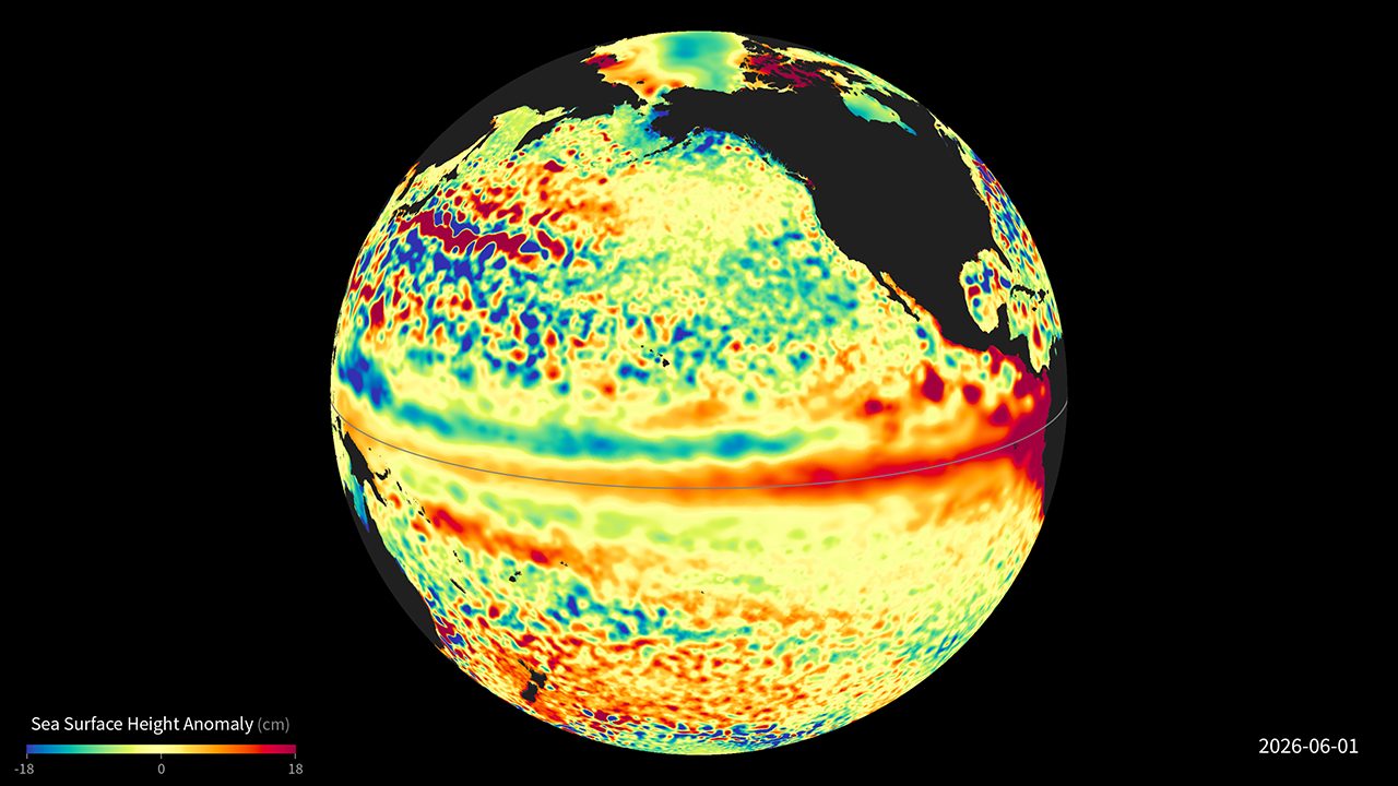
Why this rendering matters. The processing here removes the mean, the seasonal cycle and the long-term trend, leaving only the interannual anomaly. What survives that filtering is pure ENSO signal — you are seeing the thing itself with sea-level rise and the ordinary seasons stripped out. The perspective view also conveys scale in a way flat maps flatten: this is not a regional warm patch but a redistribution of the largest body of water on Earth.
Height is a proxy. Temperature is the thing itself, and NOAA measures it globally every day. The next two maps are live — they show conditions on the day you open this page.
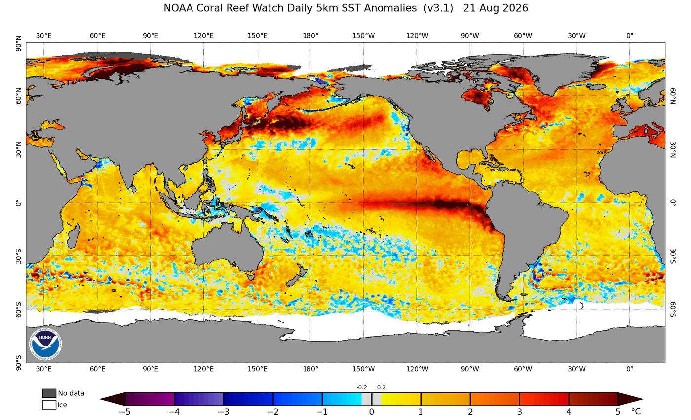
How to read it. Two features carry the analysis. First, the tongue of warmth running west to east along the equator — that is Niño 3.4, the index every forecast is quoted against.
It stood at +1.4 °C as a July monthly mean, with weekly values near +2.7 °C by mid-August. Second, look at the far eastern edge, hard against South America.
The Niño 1+2 region was already at +2.9 °C in July, and that coastal warmth is what drives the flooding-and-landslide side of the event in Peru and Ecuador while the western Pacific dries.
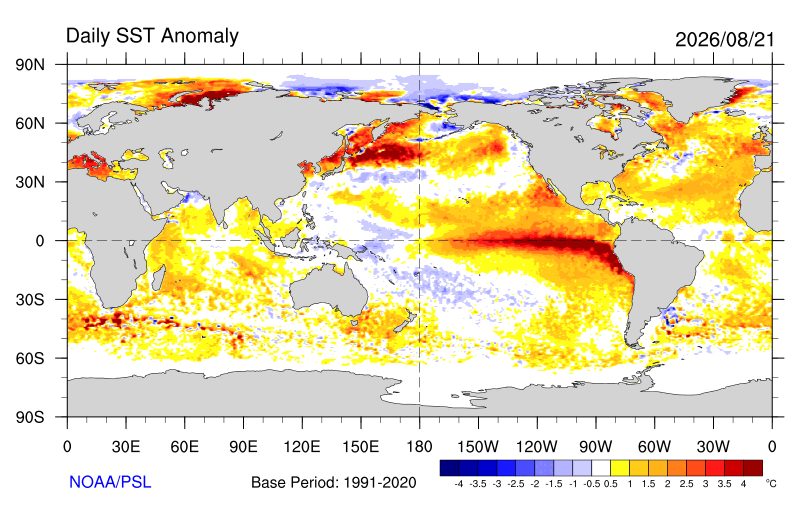
Why show the same thing twice? Because independent confirmation is how you separate a real signal from a processing artefact. Coral Reef Watch and PSL use different pipelines and different base periods; when both render the same equatorial tongue, the feature is in the ocean, not in the algorithm.
This is also the honest answer to anyone claiming the event is exaggerated — it is being measured by multiple agencies with different methods, all agreeing.
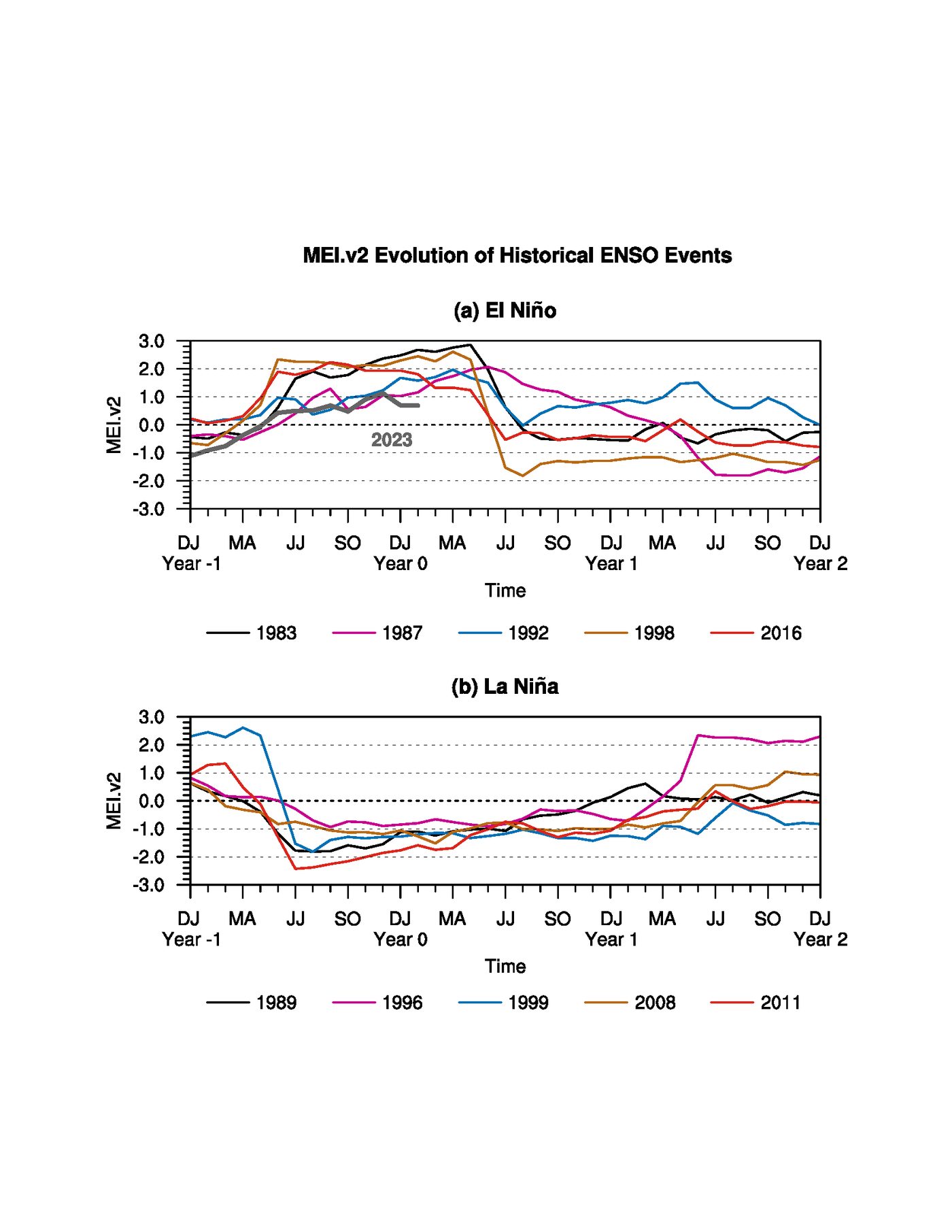
The value of this particular chart. The MEI is not a temperature index. It combines sea-level pressure, winds, sea and air temperature and cloudiness into one coupled measure — so it tracks whether the atmosphere has joined in, which is what turns a warm ocean into a global weather event.
Plotting the current event’s lifecycle against every historical analogue is how forecasters judge whether an event is tracking early, late, or off the charts entirely.
One further piece of evidence is not oceanic at all. Australia’s Southern Oscillation Index — the pressure difference between Tahiti and Darwin — has fallen to near −30, its lowest in more than 40 years.
That is the atmosphere confirming the ocean. The trade winds have genuinely reversed, not merely slackened, and ocean and atmosphere are now locked together.
The institutional response has escalated accordingly. The WMO’s El Niño/La Niña Update (May 2026) and the subsequent June–August Bulletin tracked the escalation month by month; on 31 July the agency forecast anomalies exceeding 2.9 °C and above-normal temperatures across nearly all land areas.
The UN was blunter.
“El Niño is not just on our doorstep — it is inside the house and turning up the heat. This is only a warm-up act. El Niño is strengthening, adding fuel to a planet already on fire.”
— António Guterres, UN Secretary-General, 31 July 2026
The World Meteorological Organization carried his message on its official account:
But the line that should be pinned above every agriculture ministry desk this autumn came from WMO Secretary-General Celeste Saulo, and it is not about the weather at all:
“El Niño is one of the most closely monitored climate phenomena in the world. But forecasts in themselves do not prevent hazards, people do. The decisions we make today will shape the impacts we experience tomorrow.”
Part Two- The machine, and why one ocean causes opposite disasters
The whole phenomenon is one displacement, repeated at planetary scale. Normally, trade winds blow east to west along the equator, dragging warm surface water toward Indonesia and letting cold water well up off South America. That western warm pool is where the tropical thunderstorms live, and those thunderstorms drive a circulation cell called the Walker circulation.
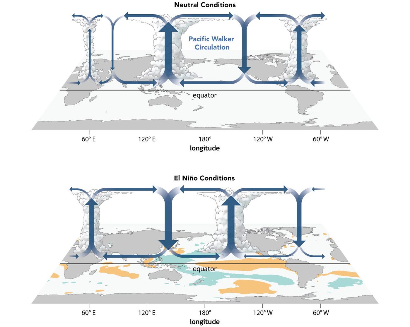
The mechanism in one sentence. When the winds fail, the warm pool sloshes east and the rising branch of the circulation — the rainfall — goes with it.
Everything downstream in this article is a consequence of that single displacement: the Indian monsoon weakening, Indonesia drying, Peru flooding, and the Atlantic hurricane season going quiet.
The critical analytical point is that this is a feedback, not a one-way push. Weaker winds allow warm water east; warmer water east weakens the winds further. That is the Bjerknes feedback, and it is why El Niño, once started, tends to run to completion — and why forecasters can call it six months out with skill they have for almost nothing else in seasonal prediction.
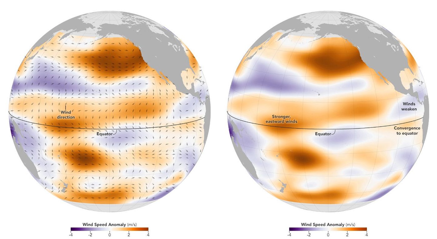
Why the winds deserve their own figure. Scatterometers measure wind by reading the roughness of the sea surface from orbit, which means the weakening trade winds are directly observed rather than inferred from pressure.
Purple here is the physical permission slip: the moment the easterlies fail, the warm pool is free to travel. This is also the field that gives the earliest warning — wind anomalies precede the ocean response by weeks.
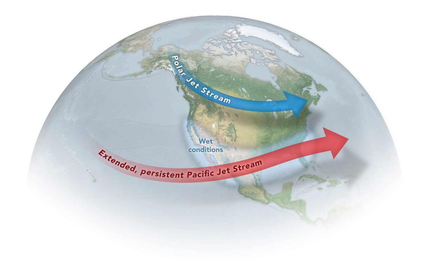
How a Pacific anomaly reaches Europe. Displacing the tropical heat engine displaces the jet streams, and the jet streams are what steer storms across mid-latitudes. This is the physical chain by which an ocean anomaly near the dateline produces a wetter, stormier autumn in the UK — which is exactly what the Met Office is now forecasting for northwest Europe, followed by an increased chance of a cold, snowy end to winter in February and March.
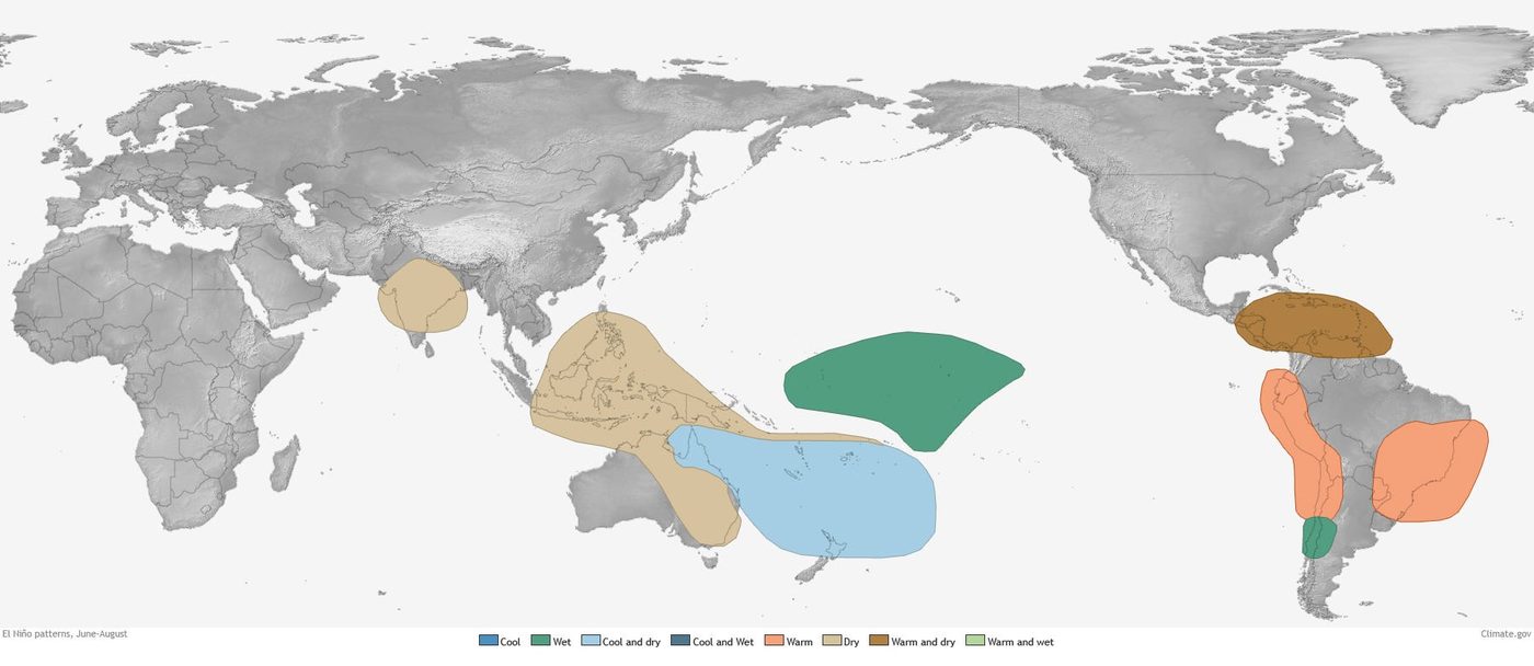
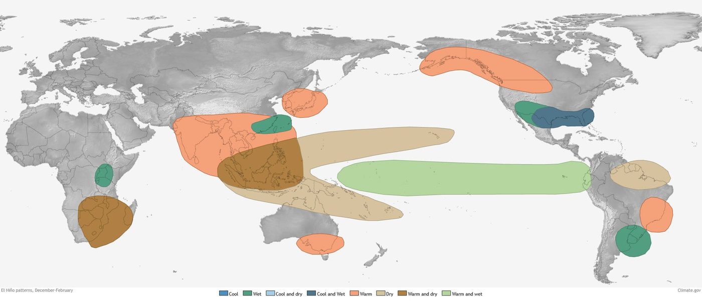
Reading the two maps together is the forecast. Figure 10 is the season that has already happened, and the dry signal it shows over India, Indonesia and northern Australia is precisely what turned up in this year’s crop data, which is a useful validation that the composites work. Figure 11 is the season the peak lands in.
Comparing them tells you which regions get a second consecutive hit: southern Africa dries in both, which is why it appears in every humanitarian projection for 2027.
The Met Office’s own regional breakdown matches: low rainfall risk across Central America, west Pacific nations, tropical South America, southern Africa and northeast Australia, with the Indian monsoon already running well below normal.
Part Three- What a peak actually looks like
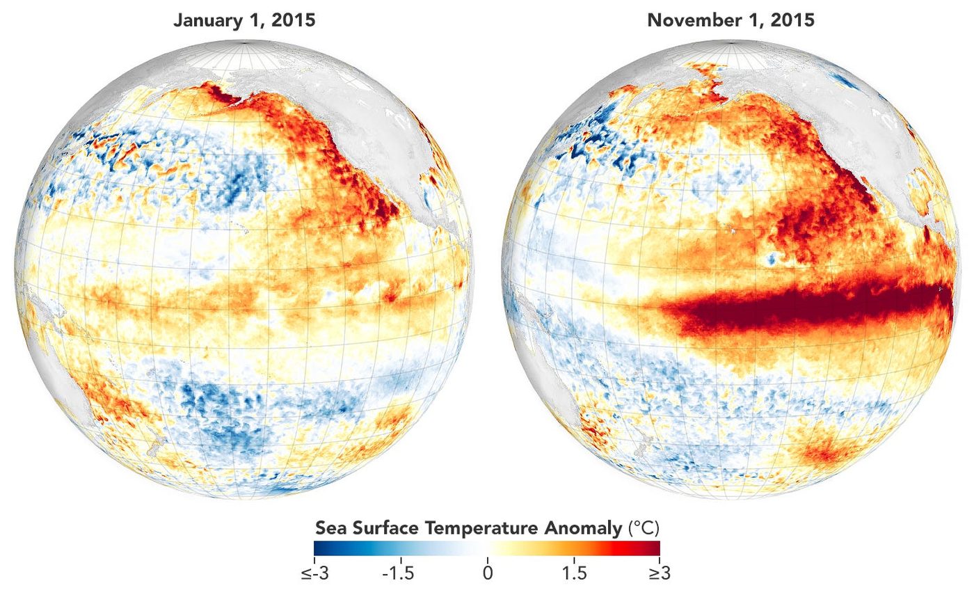
The benchmark, and why it matters that this one beats it. November 2015 is what +2.75 °C looks like from orbit — the strongest instrumentally measured El Niño on record. Every impact estimate in the second half of this article is calibrated against that event and its 2015–16 aftermath. The forecast for this winter exceeds it. When you look at Figure 4 in December, you should expect to see more red than this image shows, not less.
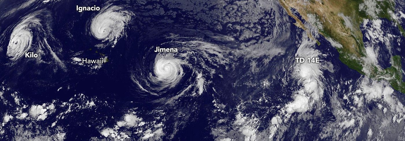
The storm ledger, redistributed. Warm water plus reduced wind shear in the eastern Pacific produces cyclone clusters that are close to impossible in neutral years.
The mirror image is the Atlantic, where the same shear that suppresses storms there is generated by the displaced circulation, which is why this season has produced only three named storms.
Read as risk, that is not good news evenly spread: it is insurance losses moving from the US Gulf coast to Pacific Mexico and Central America.
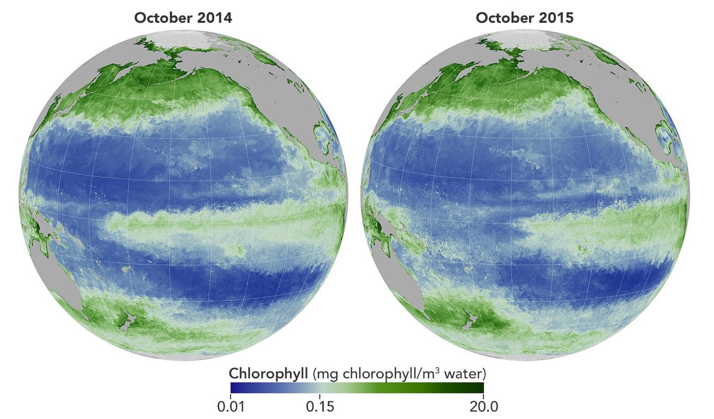
The economic channel nobody covers. Warm surface water caps the upwelling that brings nutrients up off South America. Phytoplankton collapse; the Peruvian anchoveta fishery collapses behind them. That fishery supplies a large share of the world’s fishmeal, and fishmeal feeds farmed salmon, pigs and poultry on other continents. So a chlorophyll deficit in the eastern Pacific propagates into protein costs in Norway, Chile and China within two quarters. It is the clearest example of why El Niño is a trade story, not just a weather story.
Part Four- The consequences, photographed
The following are not forecasts. They are what the previous, weaker El Niño did, recorded by satellite.
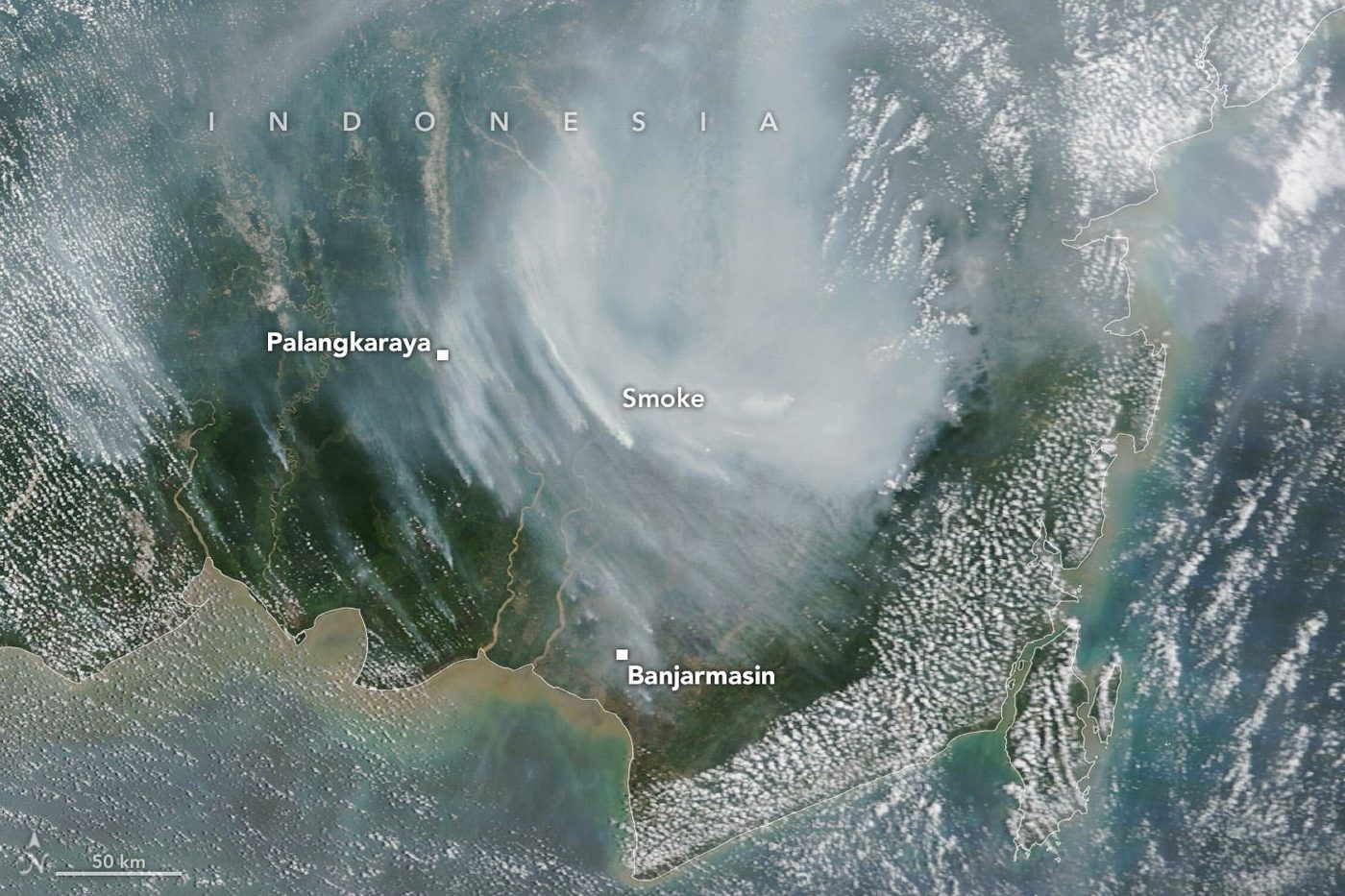
Why peat is the problem. Indonesian peatland is normally too waterlogged to burn. El Niño lowers the water table enough to ignite carbon that has been accumulating for millennia, which is why these fires are both a public-health emergency across Malaysia and Singapore and a genuine spike in global emissions.
Note the timing in the caption: 2023 was a moderate event following several quiet La Niña years. The fuel load is higher now.
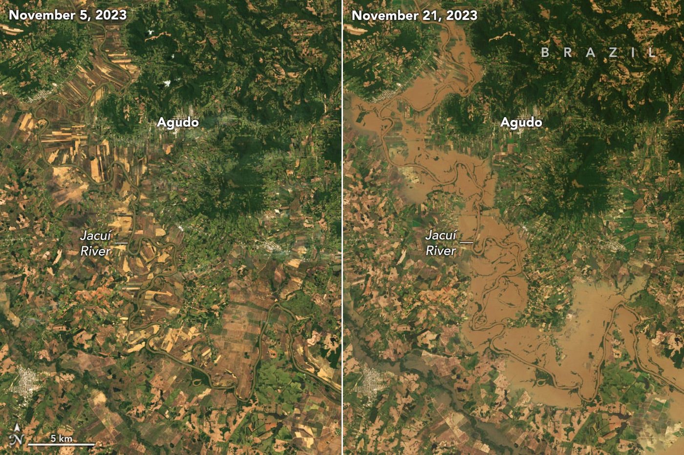
The same event, the opposite failure. This is the analytical heart of El Niño risk management: you cannot prepare with a single playbook.
The identical ocean anomaly that requires drought response in Lusaka requires flood defence in Porto Alegre in the same months. Institutions built for one hazard type systematically under-prepare for the other, and the money moves late in both directions.
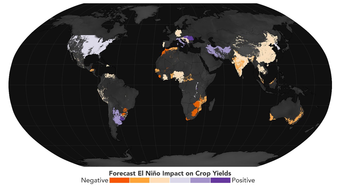
This is the receipt. FEWS NET — the US-funded Famine Early Warning Systems Network — maps expected commodity-crop impacts before harvest, and has run a dedicated El Niño 2026–2027 programme with a July 2026 briefing covering markets, agriculture, fisheries, water and energy. The FAO’s GIEWS El Niño collection does the same for the global food supply. The existence of these products is what makes any later claim of surprise indefensible.
Part Five — Region by region, with this year’s numbers
India: already counted
India is the first casualty because the monsoon runs from June to September, ahead of the peak. June rainfall came in 40% below normal — the fifth-driest June in a century, with the deficit touching 43% at its worst. Farmers responded the only way they can: by not planting.
Data figure A. Kharif sowing at the same point in the season. Sources: Ministry of Agriculture data via Down To Earth; USDA Foreign Agricultural Service GAIN report, August 2026.
Rainfall can recover; a planting decision cannot. Once the window closes, the area is lost for the season, regardless of what falls afterwards, which is precisely why the USDA titled its August assessment “Monsoon Recovery Fails to Boost Sluggish Crop Planting.”
The oilseeds collapse of nearly 40% is the number to watch, because India is already the world’s largest vegetable oil importer and vegetable oils are the highest sub-index in the FAO basket.
111 districts across 12 states are flagged vulnerable. India is the world’s largest rice exporter and second-largest sugar producer; when it restricts exports to protect domestic supply — as it has in every recent deficit year — the shortage is exported to every country that buys from it. That is the mechanism by which a weak monsoon in Madhya Pradesh becomes a bread price in West Africa.
Australia: the fire season is being assembled now
BOM’s outlook heavily favours reduced rain across the eastern states, with spring temperatures around 2 °C above the 1961–90 baseline — potentially Australia’s hottest spring on record. The honest caveat, from ABC meteorologist Tom Saunders, is that most of the country is not currently in severe drought, so a repeat of Black Summer is not the base case. Heat plus rainfall deficit dries fuel loads; Australia has the first and is forecast to get the second.
Southern Africa: the precedent that should frighten people
The 2023–24 El Niño was weaker than what is now forming, and southern Africa recorded its worst drought in a century. UN OCHA counted more than 61 million people needing urgent assistance, 40–80% of the maize crop destroyed in Malawi, Zambia and Zimbabwe, four national disaster declarations, and a $5.5 billion regional appeal. Seventy per cent of the population there depends on agriculture.
A stronger event arriving on soils and household balance sheets that have not recovered is the single most concerning line in this analysis.
Panama: where weather becomes trade policy
The Panama Canal is a freshwater staircase — each transit spends tens of millions of gallons from rain-fed Gatun Lake, which also supplies Panama City. The Authority is cutting slots to 9 Neopanamax and 23 Panamax and lowering draft to 47.5 feet from 1 October, months after expecting normal operations. October and November are supposed to be the peak of rainfall.
Part Six- Food and money
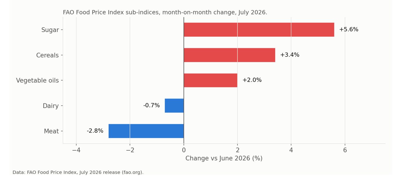
The FAO Food Price Index reached 131.1 points in July, a three-year high.
Data figure B. FAO sub-index monthly changes, July 2026. Source: FAO Food Price Index release.
The split is the signal. Meat and dairy fell; sugar, cereals and vegetable oils rose. That is not random — it separates the baskets that track demand and feed costs with a lag from the baskets that track rainfall now. When weather-exposed categories move up while demand-driven categories move down, the price pressure is coming from supply, and supply pressure from a peaking El Niño builds for another two to three quarters.
For scale on what is possible: during the last cycle cocoa rallied roughly 250%, sugar hit a decade high, coffee set a record in 2025. West Africa supplies about two-thirds of world cocoa and Côte d’Ivoire’s 2026/27 harvest is projected to fall around 20%. Nedbank expects southern African food inflation in double digits. WisdomTree flags fertiliser disruption stacking on drought — “input cost stress, a combination not seen in prior El Niño cycles.”
The economics rest on Callahan and Mankin’s 2023 paper in Science, “Persistent effect of El Niño on global economic growth,” which found the drag runs for years after the ocean cools.
Data figure C. Projected global output loss. Source: Peterson Institute for International Economics (2026), applying Callahan & Mankin (2023) elasticities.
Read the range, not the point estimate. The $7.2–28.5 trillion spread is not sloppiness — it is the honest statement of how much depends on where the rain actually falls. What is robust is the shape: losses persist for years after the ocean cools, because failed harvests deplete household assets, drive distress sales of livestock and pull children out of school, and none of that reverses when the SST anomaly does.
Data figure D. Output loss as a share of GDP by exposure group. Source: PIIE (2026).
The ten most affected countries — Ecuador, Peru, Indonesia, Malaysia, Suriname, Panama, Nicaragua, Togo, Zambia and Costa Rica include no G7 economy.
Everyone has limited fiscal space, a high food share in the consumption basket, and agriculture-heavy employment.
This is a regressive shock in the most literal sense: levied hardest on those least able to borrow, at the highest global cost of borrowing in two decades.
Part Seven — Where this sits against history and against warming
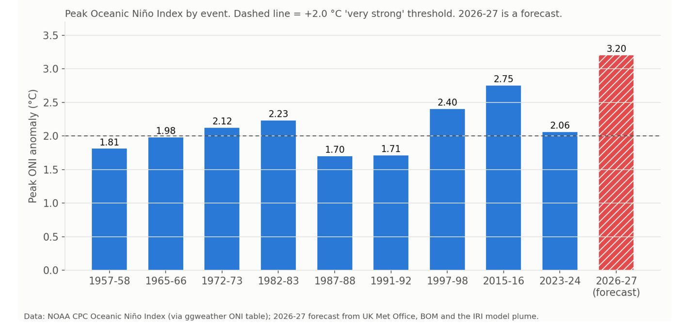
Data figure E. Peak ONI by event. Sources: NOAA CPC ONI record; Met Office, BOM and IRI forecasts.
The forecast bar is doing something unusual. It does not merely exceed the record — it exceeds it by more than the gap between the third and first strongest events on the entire instrumental chart. The pre-instrumental comparison is 1877–78, when anomalies are estimated to have reached around +3.5 °C and famine killed millions across India and China.
On the climate question, the most common error is treating El Niño as a climate-change event. It is not. It is a natural oscillation that would run without any human emissions. The relationship is arithmetic: roughly 1.5 °C of structural warming, plus a temporary El Niño increment of 0.2–0.3 °C, taking the world to about 1.7–1.8 °C briefly. Liz Bentley of the Royal Meteorological Society called climate change “the key driver” and El Niño the amplifier. The Met Office’s Professor Stephen Belcher frames it the same way: natural variability adding to a climate-change stress that is already there.
Small increment, large threshold effects. WMO now puts an 86% probability on a year between 2026 and 2030 beating 2024’s record, and 91% on the 1.5 °C level being temporarily exceeded. The Met Office now says 2027 becoming the warmest year on record is “very likely.”
What this is really a test of
El Niño is the one global shock that arrives with a receipt attached.
It is forecast months in advance, with high skill, by public agencies for free, and photographed continuously from orbit.
Every image in this article is downloadable by anyone. Every report cited is public. Nobody will be able to say afterwards that it could not have been seen.
This makes 2027 less a test of the climate system than of institutions. The forecast exists.
The exposed regions are named. The transmission chain from monsoon to sowing to price to import bill to appeal is documented across three previous events.
The 1877–78 event killed millions, and the historical verdict is that colonial grain policy and market failure did most of that killing.
The rainfall was the trigger. The famine was a decision.
Which is exactly what Celeste Saulo was saying. Forecasts do not prevent hazards. People do.
We are better equipped than 1877, and better equipped than 1997. We are also more indebted, more fragmented, and running an oil shock and two wars at the same time.
The Pacific has already made its move. It made it quietly, in March, a few hundred metres below the surface, and a satellite watched it happen.
Everything after this is a choice about who absorbs it.